Building a Scalable Design System for Cross-Platform Consistency
Overview
As a UX Design Manager and Product Design Lead, I identified a critical gap in consistency and efficiency across our suite of internal and external software products. Design and engineering teams were duplicating efforts, UI patterns varied widely, and user experiences were fragmented.
Problem Statement: Customers are experiencing an inconsistent user experience when using different S&C software applications.
To address this, I initiated, led, and executed the creation of a unified company-wide design system—one that would drive visual and functional consistency, improve development speed, and scale with our evolving product ecosystem.
Goal: Make design and development for S&C software easier, faster and consistent.
My Role
I led the vision and strategy for the design system, identifying the need for a centralized UI framework and pitching its value to cross-functional stakeholders. From the beginning, I was hands-on in the design process—leading the UX and visual design of components, defining design principles, and ensuring accessibility best practices were met.
To ensure alignment across teams, I chaired a Software Engineering Steering Committee, which helped drive technical buy-in and consistent adoption across products. I also authored detailed documentation and usage guidelines for both designers and developers to ensure clarity and consistency.
The design system started as a two-person effort between myself and one software engineer. Over time, I scaled it into a dedicated team of three designers and three developers focused on building, maintaining, and evolving the system. I also run recurring training sessions across the company to help teams adopt the system effectively and stay aligned with updates.
Process
To kick things off, I conducted a comprehensive audit of over 14 active products to identify UI inconsistencies and redundancies. I also interviewed designers and engineers to uncover friction points and opportunities for standardization. To prioritize development efforts, I facilitated a component prioritization workshop with key stakeholders. Together, we identified and aligned on the most critical components to build first, based on their frequency of use, impact on design consistency, and product needs.
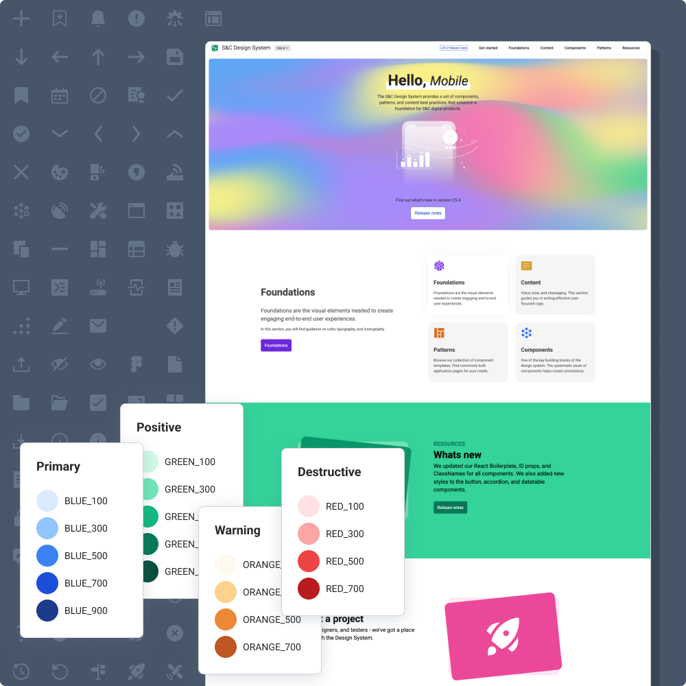
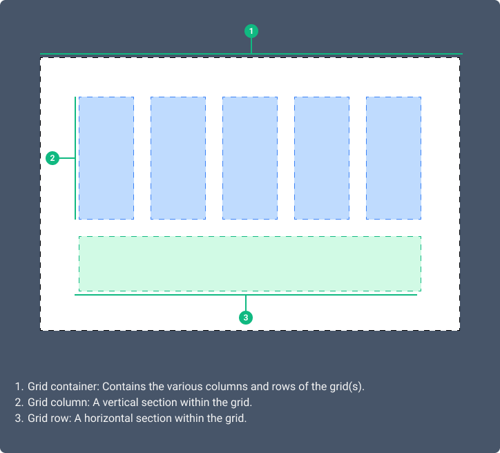
With buy-in secured, I led the definition of the system architecture. This included modular foundations like colors, typography, and spacing, as well as scalable components like buttons, inputs, and modals. I also introduced design tokens to enable consistent theming across products, including light and dark modes.
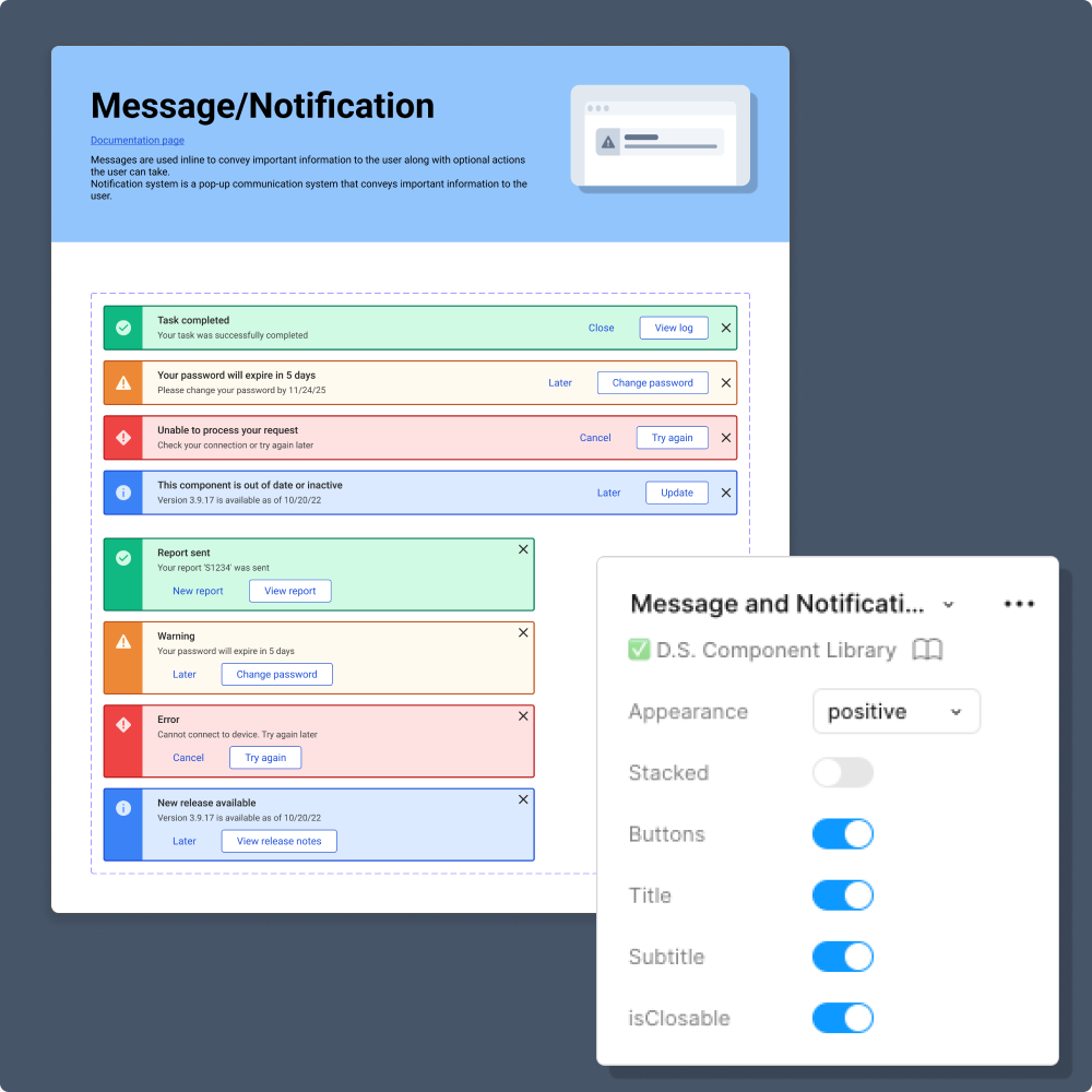
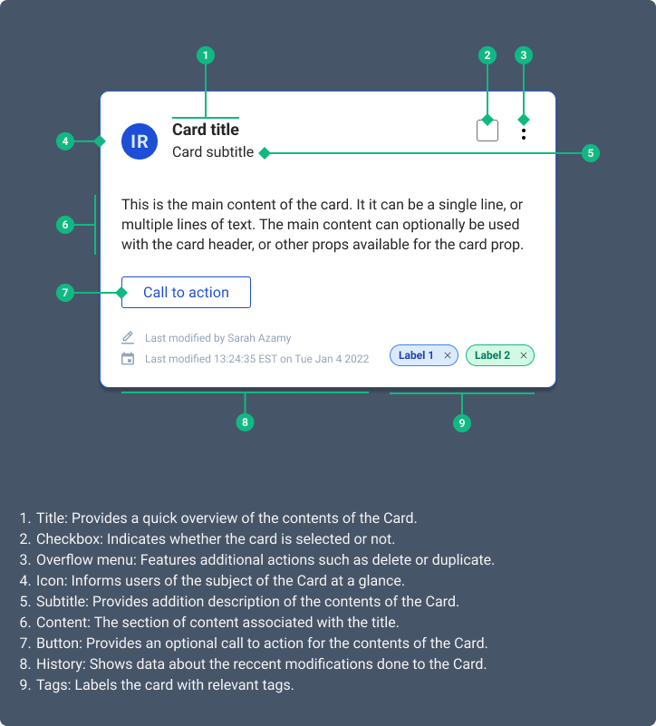
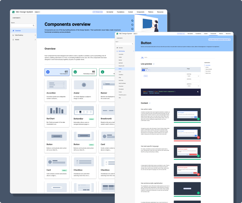
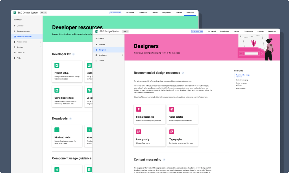
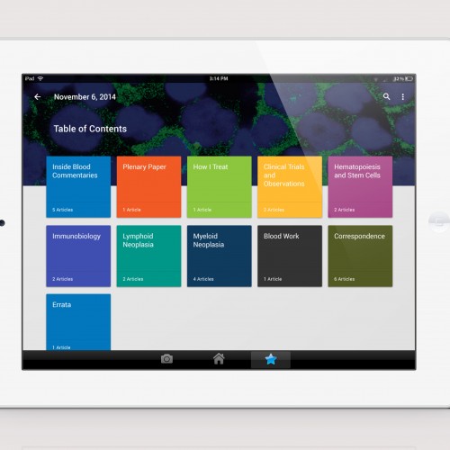
In Sketch and eventually Figma, I created and iterated on each component with input from designers and developers. I paired this work with clear naming conventions, accessibility criteria, and usage documentation. We hosted everything on a live documentation site with component specs, properties, code examples, and practical guidance. As our team grew, this work was eventually taken over by designers on my team, evolving my role into more of an art director.
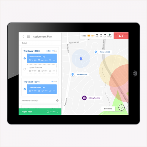
On the engineering side, I partnered closely with developers to implement a shared React component library. I personally built several of the core components in React, a technology I didn’t know before starting work on the design system. I’ve also helped to implement the UI in multiple softwares at the company using the components my team built in the design system.
The rollout of the Design System was phased, starting with high-impact features and components. As adoption grew, I expanded the team to 6 contributors. My team has also led multiple company-wide training sessions each year to onboard new team members and guide teams through the system’s capabilities and updates. While my team is not solely dedicated to designing and building the S&C Design System, it is our flagship product.
Impact
The design system led to a 32% reduction in design and development time for new UI features. It also sped up onboarding, with new designers and engineers ramping up times faster.
We achieved consistent UX across more than 6 products, with measurable improvements in usability scores. The system’s company-wide adoption was driven by strong cross-functional alignment, steering committee leadership, and ongoing education and training.
Reflection
What started as a two-person initiative has grown into a dedicated, cross-functional team committed to building better products through consistency, scalability, and thoughtful design. This project reinforced the importance of strategic vision, cross-team collaboration, and the role of design systems as both a product and an enabler of high-performance teams. Today, our design system is a core part of how we build software—faster, better, and more consistently.
My teammate, Ameer Sami, presented the S&C Design System at React Summit 2024. Watch his talk, “Beyond 1.0 – Lessons Learned and Things to Do After 1.0 Release of a Design System.”